Like this website, the blog has a pre-loader that displays until a page’s contents are finished loading. There are two main parts: A simple animated GIF and a div element controlled by a jQuery include that detects when a page is fully loaded and then makes said div fade out. This preloader works on desktop browsers, tablets and mobile devices.

I mentioned before that I’m not a fan of pre-built WordPress themes. They make so many WordPress powered websites look painfully generic, all for the sake of convenience. I guess I’m wired differently since I started learning web programming before content management systems were common. Regardless, WordPress is a very powerful CMS and there is no need to reinvent the wheel programming-wise. So I always start with the most minimalistic theme available (In this case, BlankSlate by TidyThemes as shown on the left) and build custom layouts for my WordPress installs via child theming.

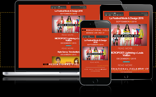
Not everyone browses the internet via a desktop computer or a laptop anymore, which is why making websites responsive is highly recommended. Basically, it means displaying the site differently depending on the device used to access it. I try to make my websites as responsive or responsive-like as possible. In this case, the blog looks different across computers, tablets and smartphones.
Note that this portfolio website is similar, but fully responsive, looking slightly different on a smartphone or desktop/laptop and or a tablet.

Another great thing about WordPress is the ability to add custom code to the vanilla install via the PHP language and the “Must-use Plugins” feature. One such use is the ability to create custom WordPress shortcodes to make adding content to posts much easier and more convenient for all users regardless of skill level. Some of these shortcodes include basic YouTube embedding and auto styling different types of text.